ONEPLUS
First images of new redesign revealed
OnePlus last month kickstarted a competition that asked its community of users to pitch new software features for future smartphones to Dragon's Den. After hundreds of submissions in the forums, the winning entry has now been announced.
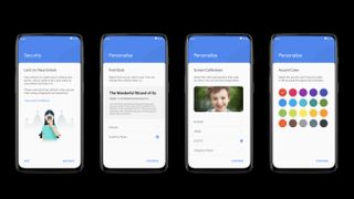
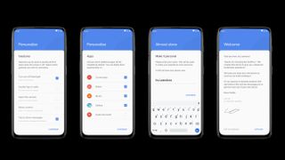
The entry, submitted by Léandro Tijink, will be coded by the OnePlus software and included in a future update to OxygenOS - the Android-based operating system that runs on all modern OnePlus devices, including the forthcoming OnePlus 7, which is widely-tipped to launch in the coming months and boast an all-screen design and pop-up selfie camera.
The winning entry is centered around a new design language for OnePlus' OxygenOS mobile operating system, which will bring some cohesion across the design.
 Léandro Tijink explains: "As a result of consistency, the usability will be dramatically improved. Basic interactions like swiping, long-pressing and tapping always needs to be consistent, users will not be surprised that something unexpected happened because they thought something else will happen . "
The OnePlus owner has published a series of high-resolution renders of the new OxygenOS design running on an unnamed handset with an all-screen design that tallies with the latest rumors about the forthcoming OnePlus 7.
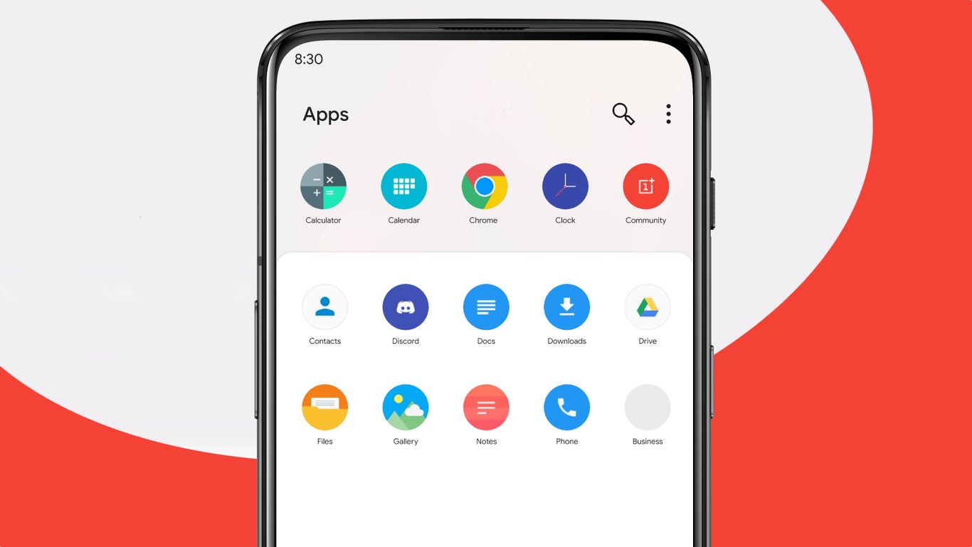
The new OxygenOS design keeps the same clean, stripped-back appearance available on current OnePlus-branded hardware, but brings a new universal design language to the software, similar to what Samsung recently rolled-out with its OneUI system for Galaxy hardware, which we praised in our Galaxy S10 Plus review.
Léandro Tijink says users should be able to customize the accent color - the color used to highlight parts of the interface when they are selected by the phone owner - to bring more personal touch to the handset.
 The OnePlus competition winner says: "Because of the consistency in design, it will be easier to say: those elements need to be blue, these need to be white, and this always needs to be red. because there are only so many colors, all used very consistently. "
Léandro Tijink says this principle could also be used in future for system fonts, themes and icons across the OxygenOS. The Quick Settings dropdown has also been simplified in the new design to make it easier to access the most frequently used toggles. For exmaple, Tijink has removed the name of the mobile carrier from the dropdown to make the menu a little clearer since "you probably already know which carrier you have, so seeing that name all the time is pretty unnecessary". A. Brown
/https://i.s3.glbimg.com/v1/AUTH_59edd422c0c84a879bd37670ae4f538a/internal_photos/bs/2025/v/p/WrtzTzRB6D5HIATHrd1A/2025-11-20t061512z-1639912283-rc2zzhakl1n5-rtrmadp-3-china-dailylife.jpg)


No comments:
Post a Comment