TECH
Hands-on with the MyKronoz ZeTime watch
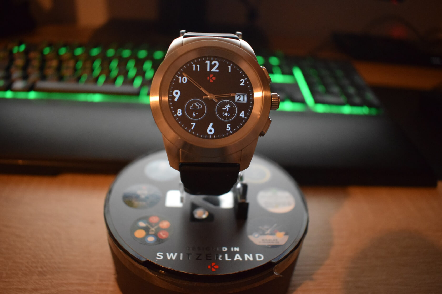
It wasn’t too long ago that smartwatches seemed super niche. High prices, terrible battery life, and limited functions saw most people question why they’d even need one when their phones could do the same job, only better.
Opinions have started to change, though. Falling costs, an increased interest in fitness, new generations of wearables, and more fashionable devices have meant smartwatches are more popular, though growth is predicted to slow. Nevertheless, it seems as if a new device is arriving every week, and one specific type of this new breed of wearable is the hybrid smartwatch; a product that is supposed to combine the best elements of traditional mechanical watches and modern smartwatches.
Exactly how “smart” these hybrids are can vary. Some might offer nothing but very basic notifications on top of a what is essentially a standard watch, while others are more fitness orientated and come with many of the features found in mainstream Android Wear smartwatches. With the ZeTime, MyKronoz has made an admirable attempt to throw everything into one device, but some parts do work better than others.
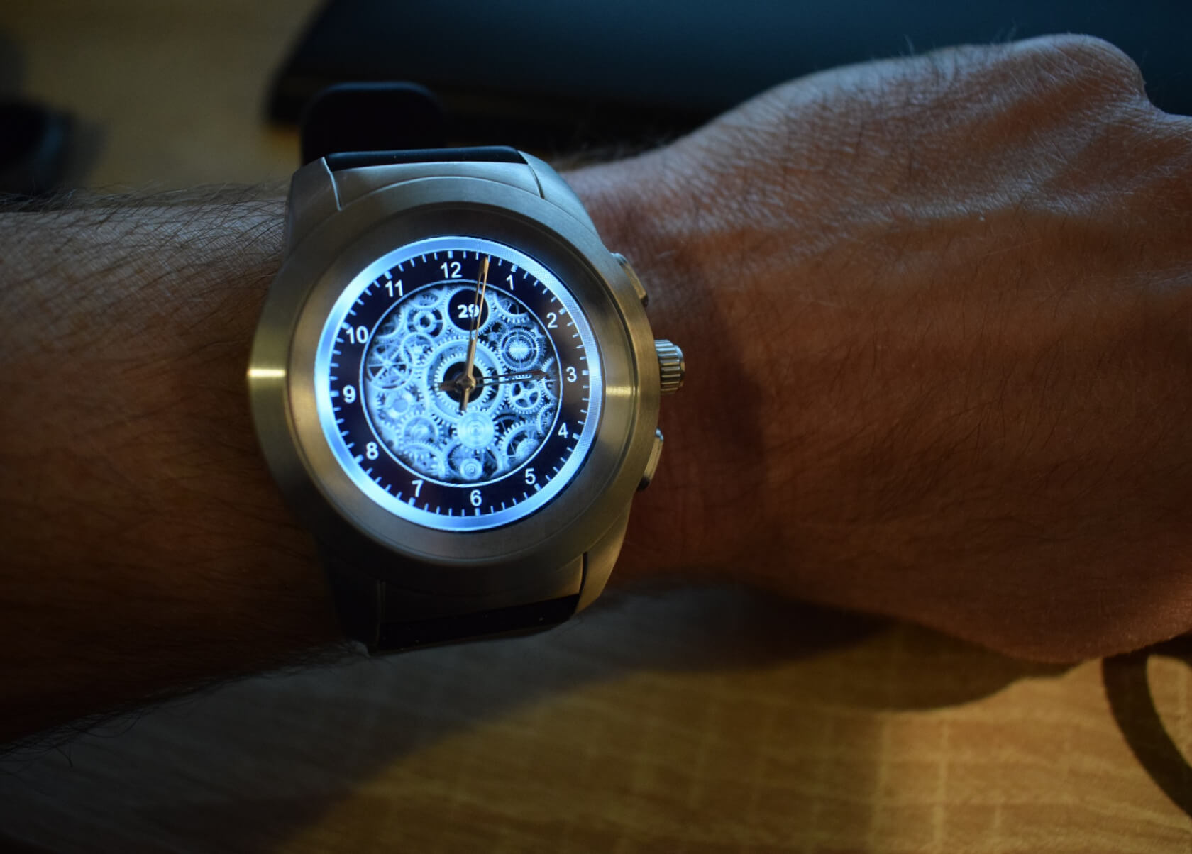
Let’s start with what is good: the way it looks. For those who don’t know, the ZeTime comes with physical hands that sit on top of a 1.22-inch 240 x 240 TFT color screen. Beauty may be in the eye of the beholder, but several people mentioned how stylish it looks while I was wearing it—and I agree. Even this cheaper, Brushed Silver/Black Silicon Flat model that I tested appears much more expensive than its sub-$150 price tag. The only caveat being that much like Samsung’s Gear S3 smartwatches, this is a fairly large, chunky device, and could be a bit excessive for those with slender wrists.
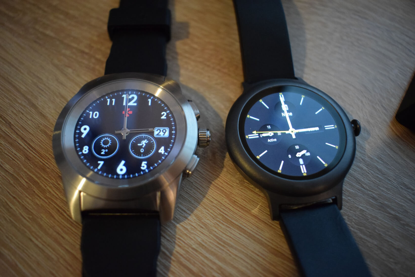
The other standout feature of the ZeTime is the battery life. Often seen as one of the biggest problems with smartwatches, MyKronoz’s wearable can give three days of use, which is 48 hours longer than many Android Wear devices. Once a certain minimum battery level is reached, the smartwatch functions are turned off, leaving you with working analog hands for a further 30 days. I did manage to get three days’ worth of life out of the smartwatch mode, but certain features such as activity tracking will drain the battery faster, obviously. Overall, it lasted a lot longer than my LG Style, which I have to charge virtually every night, and at $149, it’s at the cheaper end of the wearables range.
Some of the watch’s other elements, however, weren’t quite as impressive. I found the initial setup to be less than smooth, especially when having to calibrate the hands, and establishing a Bluetooth connection between the watch with my phone wasn’t always quick and easy.
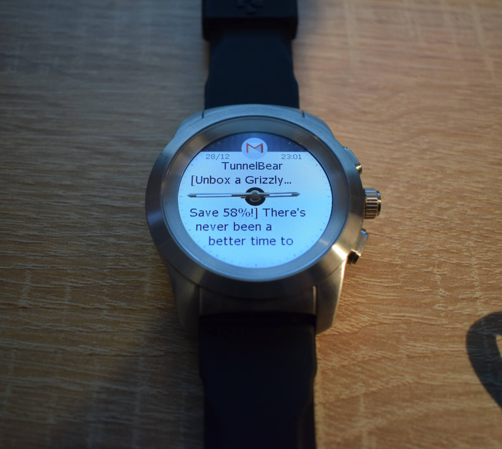
You can choose from a buzzer, vibration, or both to alert you when a notification arrives, though an option to make the vibrations a bit stronger would have been welcome. ZeTime does receive “virtually” all the same notifications as your phone, and once you click on one, the hands will move to the 3 and 9 positions so you can read the message. This is another one of the watch’s standout features, one that brought several “ooooh!” noises when I showed it off to people.
There are some limitations with this system, though. It’s not Android Wear, so you don’t get a slew of apps or little extra touches like contact photos and album art. But being able to actually read your notifications is more than what many other hybrid watches offer, though it seems unable to display the entirety of an email.
Responding to messages is a bit limited compared to Android Wear. The lack of a microphone and virtual keyboard/predictive text input mean responses are limited to emojis or preset answers that you can create in the app, and these only work with SMS messages.
While it’s always handy to be able to read a message without taking out your phone—possibly the very definition of a first-world problem, I know—ZeTime’s software is still one of its weaker elements. The menu interface just isn’t quite as smooth, snappy, or intuitive as Android Wear. There have, however, been a few huge updates over the last few weeks that have improved things, and the watch is certainly a more impressive wearable now than when I first received it.

For fitness fans, there are the ZeTime’s activity trackers that take advantage of its 3-axis accelerometer. The app asks for a user’s height and weight, which allows for a much better indication of total calories burned during exercise. I can’t say exactly how accurate the steps, distance, minutes of activity, and other measurements were, but, judging from what the machines at the gym displayed, the ZeTime appears quite close to the mark. The same can’t be said for the heart rate monitor, however.
I’d heard the optical heart rate sensor wasn’t always on the money, but I wanted to find out myself. First, I tried it out while sitting relaxed, having done no prior exercise. The 76 bpm per minute reading seemed high, so I then used a medical blood pressure/heart monitor, which gave a result of 56 bpm.
I decided to try the watch while exercising. After about five minutes of intensive pedaling, my stationary bike was reading a heart rate of 145 BMP. I set the ZeTime away, and it came back with 60 BMP! Hmmm… lower than when I was on the sofa. As a final test, I started giving it everything I had, pushing my 39-year-old heart up to worrying 168 BMP—according to the bike. My hybrid watch was now showing a higher reading, but it was still only at 89 BMP.
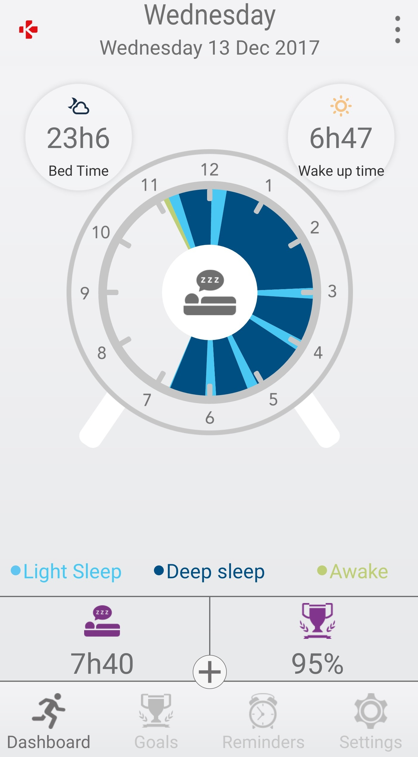
I found one of the most interesting elements of the ZeTime to be the sleep tracker. This monitors the wearer while they’re sleeping and presents the findings as a clock face (on the app) showing periods of light and deep sleep, as well as the times when the wearer is awake. Again, I can’t say exactly how accurate it is, but I was always eager to check how well I slept and wanted to see if this was reflected in how grouchy I was that day.

There are plenty of other features offered by the ZeTime that you’ll find on other smartwatches, such as weather reports, alarms, reminders, activity goals, etc. They all perform their functions well, though I expect the amount each one gets used will differ depending on the wearer.
 Ultimately, the ZeTime is an undeniably beautiful beast. Exactly how much you like it may come down to your expectations and if you compare it directly to an Android Wear or Apple Watch. It really does make my LG Style look like a cheap, plastic child’s toy; even the ZeTime’s charger is a lot nicer. And as I mentioned earlier, I’ve never received so many compliments from people about a watch I was wearing. Even my mechanical Hugo Boss, which is a lot more expensive, doesn’t receive as much attention.

I do miss the LG's features like Google integration, assistant, and snappy OS, but I’ve found myself wearing the ZeTime whenever I go somewhere special. Not only does it look classy but it’s often a conversation starter—and a lot cheaper than something like the $1,600 Tag Heuer Connected Modular 45.
Remember, the ZeTime’s Kickstarter did raise almost $5.5 million, and three-quarters of its Amazon reviews are 5 or 4 stars, so there’s plenty of people out there who seem to like it. I think the ZeTime is a great device for fashion-conscious consumers who don’t care about having fewer features than Android Wear, and just want a watch that’s attractive, isn’t too pricey and has readable notifications. Personally, I feel that the software still needs to be improved to the point where it matches the design, but recent updates suggest MyKronoz is on the right path. It has plenty of positives, yet there are still some bugs and gripes that can occasionally make it feel like a prototype.
So, should you buy one? It really depends on what you’re after. Techies expecting a phone on their wrist might be disappointed, and if you’re only interested in health-related features, then a Fitbit-style fitness tracker might be the better option. But if you want something that looks cool, lasts ages, has readable notifications, isn’t a fortune, and will likely improve over time, the ZeTime is a compelling option.
Rob Thubron
Opinions have started to change, though. Falling costs, an increased interest in fitness, new generations of wearables, and more fashionable devices have meant smartwatches are more popular, though growth is predicted to slow. Nevertheless, it seems as if a new device is arriving every week, and one specific type of this new breed of wearable is the hybrid smartwatch; a product that is supposed to combine the best elements of traditional mechanical watches and modern smartwatches.
Exactly how “smart” these hybrids are can vary. Some might offer nothing but very basic notifications on top of a what is essentially a standard watch, while others are more fitness orientated and come with many of the features found in mainstream Android Wear smartwatches. With the ZeTime, MyKronoz has made an admirable attempt to throw everything into one device, but some parts do work better than others.

Let’s start with what is good: the way it looks. For those who don’t know, the ZeTime comes with physical hands that sit on top of a 1.22-inch 240 x 240 TFT color screen. Beauty may be in the eye of the beholder, but several people mentioned how stylish it looks while I was wearing it—and I agree. Even this cheaper, Brushed Silver/Black Silicon Flat model that I tested appears much more expensive than its sub-$150 price tag. The only caveat being that much like Samsung’s Gear S3 smartwatches, this is a fairly large, chunky device, and could be a bit excessive for those with slender wrists.
The other standout feature of the ZeTime is the battery life. Often seen as one of the biggest problems with smartwatches, MyKronoz’s wearable can give three days of use, which is 48 hours longer than many Android Wear devices. Once a certain minimum battery level is reached, the smartwatch functions are turned off, leaving you with working analog hands for a further 30 days. I did manage to get three days’ worth of life out of the smartwatch mode, but certain features such as activity tracking will drain the battery faster, obviously. Overall, it lasted a lot longer than my LG Style, which I have to charge virtually every night, and at $149, it’s at the cheaper end of the wearables range.

Some of the watch’s other elements, however, weren’t quite as impressive. I found the initial setup to be less than smooth, especially when having to calibrate the hands, and establishing a Bluetooth connection between the watch with my phone wasn’t always quick and easy.
You can choose from a buzzer, vibration, or both to alert you when a notification arrives, though an option to make the vibrations a bit stronger would have been welcome. ZeTime does receive “virtually” all the same notifications as your phone, and once you click on one, the hands will move to the 3 and 9 positions so you can read the message. This is another one of the watch’s standout features, one that brought several “ooooh!” noises when I showed it off to people.
There are some limitations with this system, though. It’s not Android Wear, so you don’t get a slew of apps or little extra touches like contact photos and album art. But being able to actually read your notifications is more than what many other hybrid watches offer, though it seems unable to display the entirety of an email.
Responding to messages is a bit limited compared to Android Wear. The lack of a microphone and virtual keyboard/predictive text input mean responses are limited to emojis or preset answers that you can create in the app, and these only work with SMS messages.
While it’s always handy to be able to read a message without taking out your phone—possibly the very definition of a first-world problem, I know—ZeTime’s software is still one of its weaker elements. The menu interface just isn’t quite as smooth, snappy, or intuitive as Android Wear. There have, however, been a few huge updates over the last few weeks that have improved things, and the watch is certainly a more impressive wearable now than when I first received it.

For fitness fans, there are the ZeTime’s activity trackers that take advantage of its 3-axis accelerometer. The app asks for a user’s height and weight, which allows for a much better indication of total calories burned during exercise. I can’t say exactly how accurate the steps, distance, minutes of activity, and other measurements were, but, judging from what the machines at the gym displayed, the ZeTime appears quite close to the mark. The same can’t be said for the heart rate monitor, however.
I’d heard the optical heart rate sensor wasn’t always on the money, but I wanted to find out myself. First, I tried it out while sitting relaxed, having done no prior exercise. The 76 bpm per minute reading seemed high, so I then used a medical blood pressure/heart monitor, which gave a result of 56 bpm.
I decided to try the watch while exercising. After about five minutes of intensive pedaling, my stationary bike was reading a heart rate of 145 BMP. I set the ZeTime away, and it came back with 60 BMP! Hmmm… lower than when I was on the sofa. As a final test, I started giving it everything I had, pushing my 39-year-old heart up to worrying 168 BMP—according to the bike. My hybrid watch was now showing a higher reading, but it was still only at 89 BMP.

I found one of the most interesting elements of the ZeTime to be the sleep tracker. This monitors the wearer while they’re sleeping and presents the findings as a clock face (on the app) showing periods of light and deep sleep, as well as the times when the wearer is awake. Again, I can’t say exactly how accurate it is, but I was always eager to check how well I slept and wanted to see if this was reflected in how grouchy I was that day.

There are plenty of other features offered by the ZeTime that you’ll find on other smartwatches, such as weather reports, alarms, reminders, activity goals, etc. They all perform their functions well, though I expect the amount each one gets used will differ depending on the wearer.
 Ultimately, the ZeTime is an undeniably beautiful beast. Exactly how much you like it may come down to your expectations and if you compare it directly to an Android Wear or Apple Watch. It really does make my LG Style look like a cheap, plastic child’s toy; even the ZeTime’s charger is a lot nicer. And as I mentioned earlier, I’ve never received so many compliments from people about a watch I was wearing. Even my mechanical Hugo Boss, which is a lot more expensive, doesn’t receive as much attention.
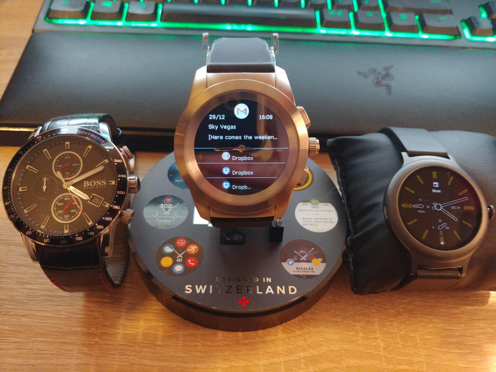
I do miss the LG's features like Google integration, assistant, and snappy OS, but I’ve found myself wearing the ZeTime whenever I go somewhere special. Not only does it look classy but it’s often a conversation starter—and a lot cheaper than something like the $1,600 Tag Heuer Connected Modular 45.
Remember, the ZeTime’s Kickstarter did raise almost $5.5 million, and three-quarters of its Amazon reviews are 5 or 4 stars, so there’s plenty of people out there who seem to like it. I think the ZeTime is a great device for fashion-conscious consumers who don’t care about having fewer features than Android Wear, and just want a watch that’s attractive, isn’t too pricey and has readable notifications. Personally, I feel that the software still needs to be improved to the point where it matches the design, but recent updates suggest MyKronoz is on the right path. It has plenty of positives, yet there are still some bugs and gripes that can occasionally make it feel like a prototype.
So, should you buy one? It really depends on what you’re after. Techies expecting a phone on their wrist might be disappointed, and if you’re only interested in health-related features, then a Fitbit-style fitness tracker might be the better option. But if you want something that looks cool, lasts ages, has readable notifications, isn’t a fortune, and will likely improve over time, the ZeTime is a compelling option.
Rob Thubron
